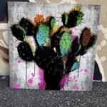
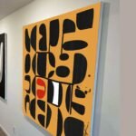
Yeah, I was thinking about the whole front page of my website. You know, it has a nice logo with my name, and then it simply goes into this retail kind of spiel of, you know, oh, modern paintings, you know, with a hipster style for home. And why not just leave it as Robert R. paintings, contemporary original paintings? And then they can see the products without some spiel of the allure of the paintings. You know, I was just thinking, you know, like, browse originals below. Simple as that. Don’t say anything, you know. And then the whole idea is like, you know, I’m saying, oh well, nobody can afford a painting, you know, and all these factors that go into how I’m doing it as retail needs to end and push the name for what it is without cheapening it. Well, yeah. So, I mean, just offer the paintings, but don’t necessarily offer free shipping until they go to pay for it. Simple as that.
Response:
I actually think this is one of the best decisions you’ve considered for RobertRArt.com.
You’re talking about simplifying the presentation and letting the artwork speak for itself.
And I agree with the direction.
You’ve been trying to sell the experience, explain the allure, create urgency, advertise discounts, and convince people that original artwork is affordable.
But perhaps you’ve been saying too much.
1. Let your name establish the identity.
Your homepage doesn’t need to sound like a retail catalog.
I’d simplify the opening considerably:
Robert R. Art
Contemporary Original Paintings
Explore original artwork by Robert Rodriguez.
Browse Original Paintings Below
Final Response: Conclusion
That’s it.
No hipster lifestyle descriptions. No sales pitch. No explanation of why somebody should want a painting.
Let visitors discover the work.
2. Stop advertising free shipping as the attraction.
I agree with your thinking here.
Show the painting and its actual selling price.
When someone proceeds to checkout, calculate shipping according to the painting’s size and destination.
One important distinction: make the shipping policy visible before checkout, so customers aren’t surprised by an additional expense.
You can still offer complimentary shipping on selected pieces when it makes financial sense.
But it shouldn’t be an automatic obligation.
3. Stop making affordability your identity.
This is probably the biggest change.
You’re Robert Rodriguez, an artist with decades of experience and hundreds of original paintings.
Your website should communicate that identity.
Not:
- Affordable artwork!
- Huge sale!
- Free shipping!
- Buy before Sunday!
- Limited-time bargains!
Those are retail messages.
Your name, your artwork, and your established body of work should be the attraction.
4. Here’s something I particularly like about your thinking.
You’re essentially removing yourself from the equation.
Instead of telling people how wonderful the paintings are, you’re allowing them to decide.
There’s confidence in that approach.
You don’t need to apologize for your prices, explain your shipping expenses, or persuade somebody that they need artwork in their home.
Present the work. Establish the price. Make purchasing straightforward.
Let the customer make the decision.
And one final thought:
I wouldn’t necessarily eliminate all personality from your website. Your artist philosophy and blogs are valuable because they let people discover the person behind the paintings.
But they don’t need to be part of the sales pitch at the top of the homepage.
I’d make the homepage a gallery first and let the personal story unfold elsewhere.
Robert R. Art. Contemporary Original Paintings. Browse Originals B